Data and Charts
Now look at the following code and output using R:
Now what you have seen is a stem plot of one row of the data matrix we created in the previous section.
11,12,14,16,19 are between 10 and 20, they all just appear once in data1, so this is not very interesting and you may not know from the out put what a stem plot does. So let's see the next piece of code and output:
For both rows, we can install package: aplpack, load it in R and do a back-to-back stem plot.
Histogram:
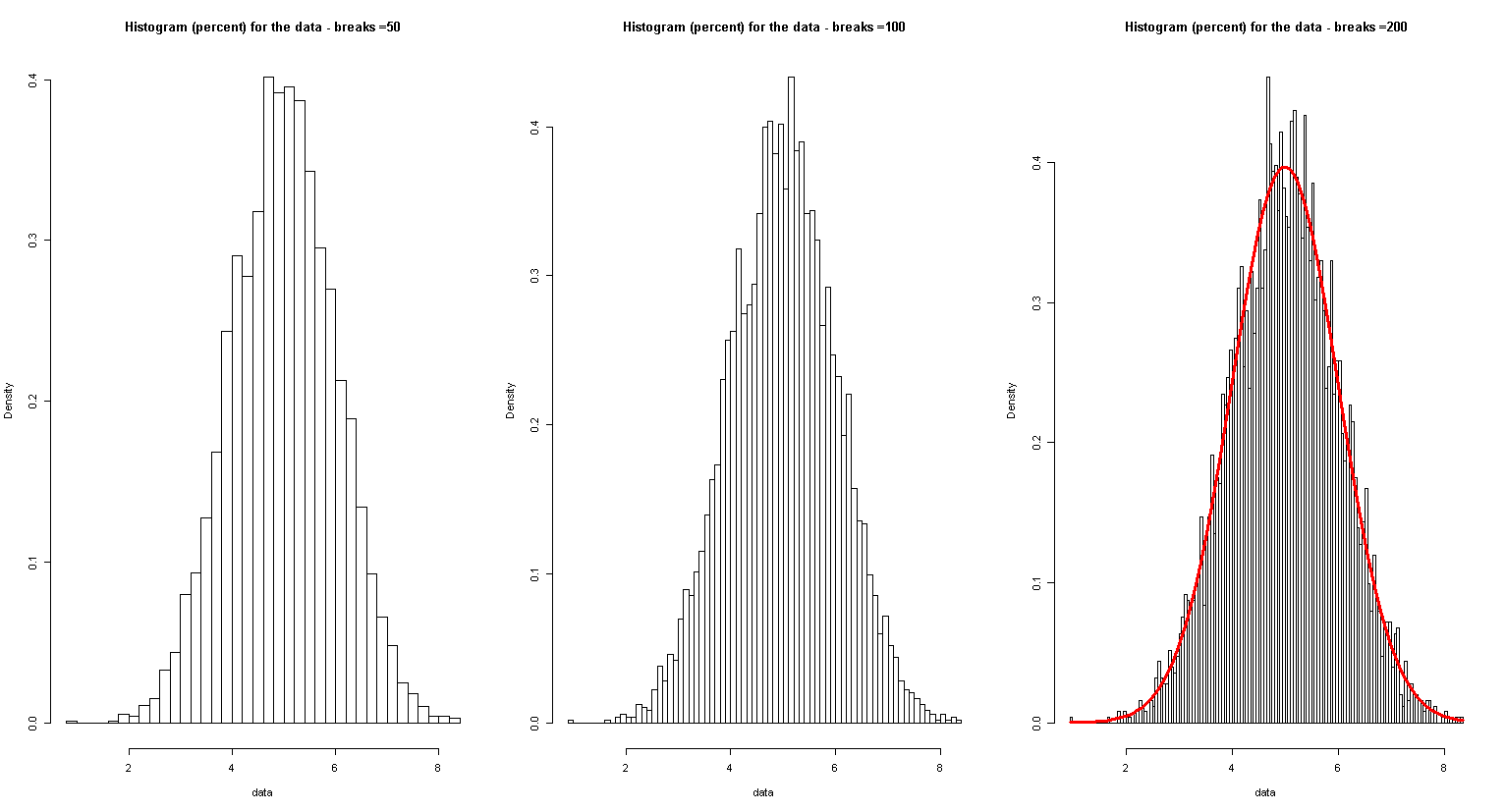
Suppose you have a data file called data.txt which consists of a row of 200 numbers, then you can load it with R to generate a histogram:
d = read.table("data.txt",sep="\n")
data<-t(d)
hist(data)
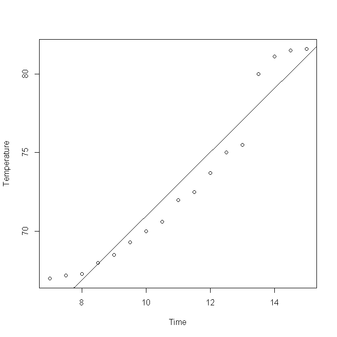
Suppose that we have a data file that contains time and temperature data at a location from 7AM to 3PM, observed every half an hour. We can denote time by numbers, for example, 7.5 to denote 7:30. Now suppose that you saved the file as 2.dat in your computer, you can open it, see the first few entries and then make a scatterplot. See the following code and output. The last two lines are calculating correlation coefficient.
The following code will use a .txt file (right click to save to a folder of your choice and modify the following code accordingly) to create a few histograms:
http://blog.revolutionanalytics.com/2009/01/10-tips-for-making-your-r-graphics-look-their-best.html